
How to Build a Secret Dark Mode Toggle for Your Blog

When I started redesigning my blog a few weeks ago, I decided to put an easter egg in it. The original idea was to build a hidden game — like the T-Rex runner in Chrome. Pretty soon, it became clear that it could easily grow into a larger project then the blog itself. I couldn’t justify that for an easter egg. I had to come up with something simpler.
One night, I was working late, migrating my old posts over. I forgot to dial the brightness on my screen down, which made the black text on white background particularly harsh on the eyes.
‘Having dark mode would be great,’ I thought. ‘And what about secret dark mode?’
Now, that was an idea.
What You’ll Learn
In this tutorial, I’ll explain the steps I took to build the Easter egg. Feel free to build it exactly as I did it or mix and match different parts.
You’ll learn how to
- implement dark mode on the web,
- detect the OS dark mode setting,
- build a toggle switch,
- and hide something on a page.
To avoid having to import a component framework into an otherwise static site, I did everything in vanilla HTML, CSS and JS.
Implementing dark mode
There are multiple ways to do this. I went down the custom properties route. The browser support is pretty good these days, but beware if you need to support older browsers.
We’ll define custom properties for any colours that will need to change when switching between the light and dark themes. These should be accessible from anywhere in the document, so we’ll put them under the :root pseudo-class.
:root {
  --background-color: #f6f6f6;
  --font-color: #222;
  --font-lighter-color: #444;
}
This will be the default theme (light in this case). You can reference these colours using the var(--custom-prop) syntax in your stylesheets. Now, let’s define the dark theme.
:root.dark {
  --background-color: #222;
  --font-color: #f6f6f6;
  --font-lighter-color: #ccc;
}
These properties will override the original ones when we add the dark class to our root element (the <html> tag). Try doing that manually to see whether the theme changes.
<html class="dark">
  <head>...</head>
  <body>...</body>
</html>
Detecting OS-level dark mode setting
Most operating systems come with a setting that allows users to switch between the light and dark versions of the system UI. Some phones even change it automatically based on the time of day or available ambient light.
Fortunately for web devs, there’s a media query to detect just that. We’ll use it to show the dark mode by default for users with their system UI set to dark.
@media (prefers-color-scheme: dark) {
  :root {
    --background-color: #222;
    --font-color: #f6f6f6;
    --font-lighter-color: #ccc;
  }

  :root.light {
    --background-color: #f6f6f6;
    --font-color: #222;
    --font-lighter-color: #444;
  }
}
We’ll also define a new class called light that we’ll use to override the defaults later.
When a user comes to our site, they’ll see a theme based on their OS setting. But they can’t change it yet. For that, we’ll need to build a toggle.
Toggle Switch
To build a simple toggle, we’ll use the old label-and-invisible-checkbox trick. Although it won’t be visible, the checkbox will store the state of our toggle. Using a clever combination of CSS selectors, we’ll be able to control the toggle’s position without adding any JS.
Here’s the HTML:
<label class="toggle-switch" for="toggle-input">
    <input id="toggle-input" type="checkbox">
    <div class="toggle-switch__control"></div>
</label>
When paired with a checkbox, clicking a label is the same as clicking the checkbox itself. This will allow us to change its state despite it being hidden.
Here’s the CSS:
.toggle-switch {
    display: block;
}

#toggle-input {
    display: none;
}

.toggle-switch__control {
    width: 40px;
    height: 14px;
    border-radius: 7px;
    position: relative;

    background: #999;

    cursor: pointer;

    margin: 50px auto;
}

.toggle-switch__control::after {
    content: '';
    display: block;

    width: 20px;
    height: 20px;
    border-radius: 10px;

    position: absolute;
    left: -1px;
    top: -3px;

    background: var(--background-color);

    transition: left 0.25s;
}

#toggle-input:checked + .toggle-switch__control::after {
    left: 21px;
}
The toggle-switch__button div makes up the background track of the switch. The knob at the front is an ::after pseudo-element positioned on top of it. We combine the :checked and + CSS selectors to change its position based on the state of the checkbox input. That way, we can avoid using any JS to animate the button.
I also placed an icon next to the toggle that shows which theme is on. See the CodePen at the end of the post for more details on how to do that.
Switching Themes
First, we’ll define a function called setTheme to switch between the light and dark themes.
function setTheme(theme, persist = false) {
    const on = theme;
    const off = theme === 'light' ? 'dark' : 'light'

    const htmlEl = document.documentElement;
    htmlEl.classList.add(on);
    htmlEl.classList.remove(off);

    if (persist) {
        localStorage.setItem('preferred-theme', theme);
    }
}
The function adds the appropriate class to the document root based on the theme argument. If persist is set, it’ll store the setting in localStorage.
Now, we need to hook setTheme() up to the toggle. We’ll add a listener for the click event on the hidden checkbox.
const toggle = document.getElementById('toggle-input');
const lightIcon = document.getElementById('light-icon');
const darkIcon = document.getElementById('dark-icon');

function updateUI(theme) {
    toggle.checked = theme === 'light';

    if (theme === 'light') {
        lightIcon.classList.add('active');
        darkIcon.classList.remove('active');
    } else {
        darkIcon.classList.add('active');
        lightIcon.classList.remove('active');
    }
}

toggle.addEventListener('click', () => {
    const theme = toggle.checked ? 'light' : 'dark';
    setTheme(theme, true);
    updateUI(theme);
});
Finally, we’ll need to call setTheme() and updateUI() to set the initial theme based on the user’s settings when the page loads up.
const osPreference = window.matchMedia('(prefers-color-scheme: dark)').matches ? 'dark' : 'light';
const preferredTheme = localStorage.getItem('preferred-theme') || osPreference;

setTheme(preferredTheme, false);
updateUI(preferredTheme);
The localStorage value takes precedence over the system-wide setting detected via media query. At this point, we don’t want to persist the setting into localStorage. We also need to set the toggle in the correct position and show the correct icon.
This is it for the dark mode support.
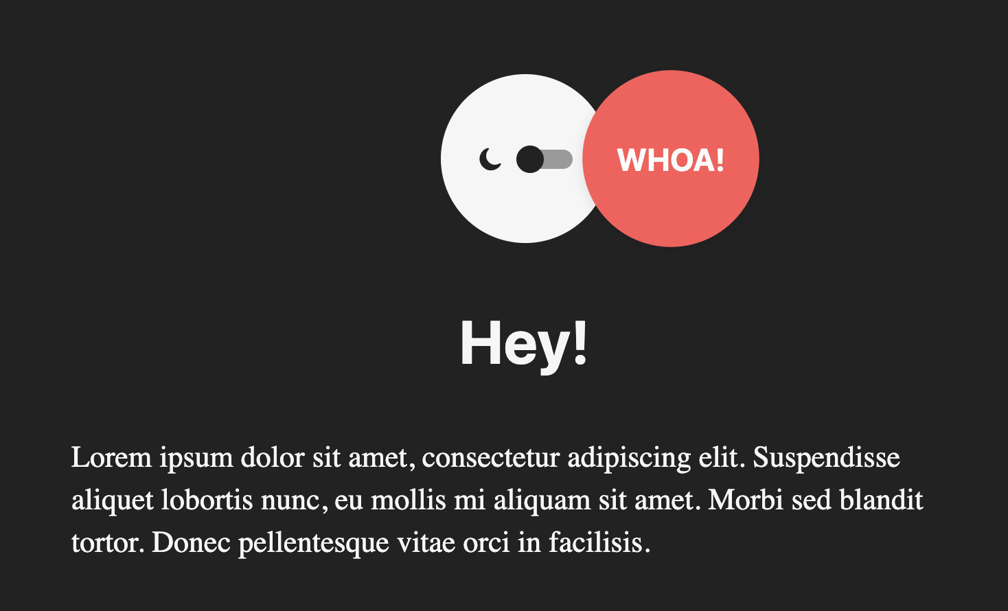
Hiding the Toggle
First, we’ll centre the toggle inside a container and position another one on top of it using position: absolute. Here’s the HTML:
<div class="site-logo">
    <div class="site-logo__toggle-container">
        <img src="https://radek.io/files/light-icon.svg" id="light-icon">
        <img src="https://radek.io/files/dark-icon.svg" id="dark-icon">
        <label class="toggle-switch" for="toggle-input">
            <input id="toggle-input" type="checkbox">
            <div class="toggle-switch__control"></div>
        </label>
    </div>
    <div class="site-logo__logo">
        WHOA!
    </div>
</div>
In the CSS, we’ll position .site-logo__toggle-container and site-logo__logo absolutely. The toggle container will be slightly smaller and slightly offset (1px) relative to the logo to avoid rendering artefacts around the edges. The --open modifier will describe the position of the logo when it’s open.
.site-logo {
    width: 125px;
    height: 125px;

    position: relative;
    margin: 40px auto;
}

.site-logo__toggle-container,
.site-logo__logo {
    display: flex;
    flex-direction: row;
    align-items: center;
    justify-content: center;

    position: absolute;
    border-radius: 50%;
}

.site-logo__toggle-container {
    width: calc(100% - 2px);
    height: calc(100% - 2px);

    top: 1px;
    left: 1px;

    background: var(--font-color);
}

.site-logo__logo {
    background: #ff5857;

    color: white;
    font-weight: bold;

    box-shadow: 0 2px 8px rgba(0, 0, 0, 0.1);

    width: 100%;
    height: 100%;
    border-radius: 50%;

    cursor: pointer;
    transition: all 0.25s;
    left: 0;
}

.site-logo__logo:hover {
    transform: scale(1.03);
}

.site-logo__logo--open {
    left: 85%;
    transform: scale(1.03);
}
Now, let’s give the user the ability to discover the toggle. Because we also want the logo to close when the user clicks anywhere else on the page, our setup will be slightly more complicated. We’ll have to attach a listener to window to check whenever the logo should auto-close.
const logo = document.querySelector('.site-logo__logo');
const container = document.querySelector('.site-logo__toggle-container');

function isLogoOpen() {
  return logo.classList.contains('site-logo__logo--open');
}

function autoClose(e) {
  if (isLogoOpen()) {
    const path = e.composedPath();
    if (path.indexOf(container) < 0 && path.indexOf(logo) < 0) {
      closeLogo();
      window.removeEventListener('click', autoClose);
    }
  }
}

function openLogo() {
  logo.classList.add('site-logo__logo--open');
  window.addEventListener('click', autoClose);
}

function closeLogo() {
  logo.classList.remove('site-logo__logo--open');
  window.removeEventListener('click', autoClose);
}

logo.addEventListener('click', () => isLogoOpen() ? closeLogo() : openLogo());
The End
That’s everything you need to hide a secret dark mode toggle or any other Easter egg on your site. Use it as it is or experiment and turn it into something completely different!
Here’s a CodePen with the full working implementation.
Enjoyed the post? Sign up for my newsletter and be the first one to know when I publish the next one.